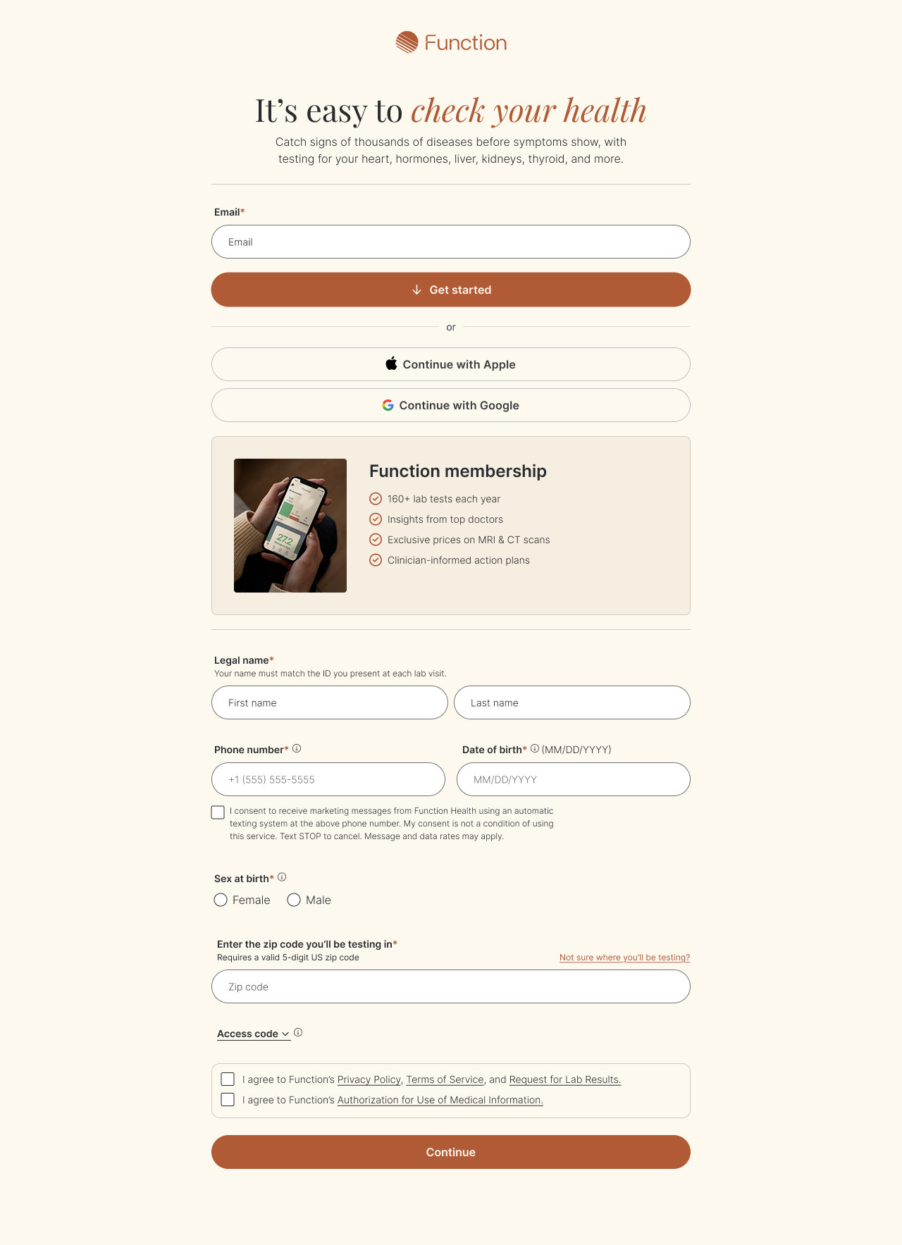
Simplified signup page 

This redesign of Function’s signup page reduced confusion (and ops outreach), and better communicated the value of membership.

Context

Members were trying to use the old signup form (at left) to gift Function memberships. This led to confusion—and a high volume of support tickets for our operations team.

Approach

  • Audited the form with a product designer

  • Identified cause of confusion (lack of gift pathway)

  • Saw an opportunity to improve other elements, including outdated copy and overwhelming page length

What changed

  • A more compelling, inviting call to “Join”

  • A more detailed version of Function’s value props (including clearer copy around the two visits per year)

  • A requirement to indicate who the membership is for (with a “someone else” option leading to the gifting flow)

  • A consolidated form and single CTA, bringing the page down to ~60% of its original length

Next
Next

The Lumen Project